
#10: color analysis 101 (part 1)
confused???? start here!

Well well well, if it isn’t another girl talking about color analysis on the internet!
If you’ve read any of my previous stories, then you may recall times when I’ve said things like “I’m a Bright Spring”, or “Gray is soft and cool,” and you also may have been like wtf is she talking about. Sounds about right. Hopefully, this week’s story will help clear things up, because I’m here to help!
who is she?
From Wikipedia:
“Color analysis (American English; colour analysis in Commonwealth English), also known as personal color analysis (PCA), seasonal color analysis, or skin-tone matching, is a term often used within the cosmetics and fashion industry to describe a method of determining the colors of clothing, makeup, hairstyle that harmonizes with a person's skin complexion, eye color, and hair color for use in wardrobe planning and style consulting. Color analysis theory claims that some colors will draw attention to wrinkles or uneven skin tone while other colors will enhance the individual's features.”
Tl;dr: some colors look more harmonious than others on people according to their undertone. I think we all know this instinctively. We’ve all bought an item of clothing in a color we love on the rack, and then every time we go to wear it something feels off and we end up letting it hang in our closets for years. Or, we’ve all said something like, “I can’t wear [insert color], it makes me look washed out.” Color analysis is also more about how color affects the face, specifically – how light from color bounces onto your face and either makes it look healthier, or more drained of color.
why is she?
Breezing past color theory, whose humble beginnings trace back to as early as the 18th century, the origins of color analysis stem from Johann Wolfgang von Goethe, a German writer and philosopher who explored the psychological impact of color and defined warm colors as yellow-based and cool colors as blue-based (this is a very important detail we’ll revisit later.) In 1980 this concept became available to a wider audience with image consultant Carole Jackson’s famous book Color Me Beautiful.
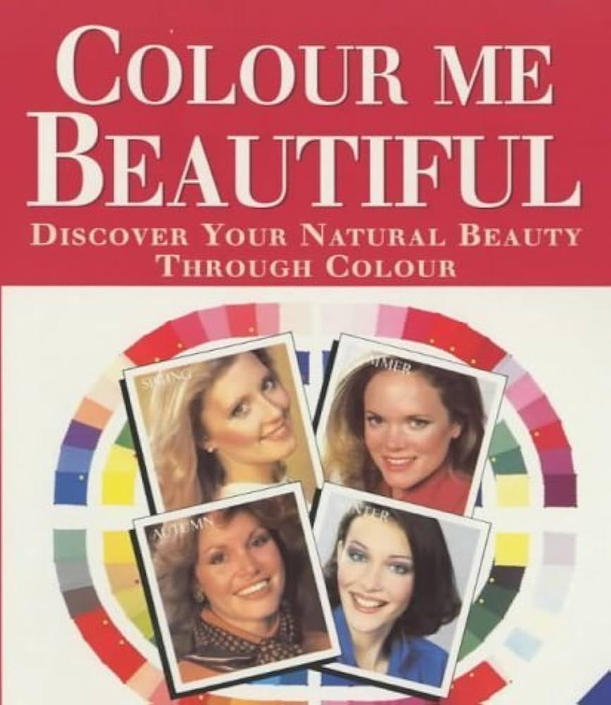
In the book, she divides individuals into four main “seasons based on their coloring: Winter, Spring, Summer, and Autumn. Since then, the concept of seasonal color analysis has been further developed and adapted by various image consultants and stylists to expand beyond the original four seasons with not just a focus on undertone, but also intensity and value. It’s also become more inclusive to not just have white people as examples, hooray! So now we have 16 sub-seasons (3 for each season.)
the road to finding my color season
When or how exactly I got into all this is a bit of a blur, but it’s taken up a good portion of my brain space for about two years now; trying to DIY figure out my color season, going a little mad over it, thinking I was a summer, then an autumn, then a winter (boy, was I off), and talking with the energy of a conspiracy theorist to anybody who would listen.
After taking in as much information as possible, I landed on that I was probably some sort of Spring. But… I still wanted an official confirmation. Daniel got me an online session with a professional for my birthday gift last August, and what do you know? I’m a Bright Spring!
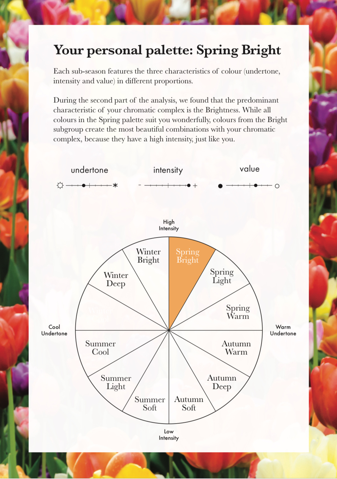

I wish I had taken screenshots of the slide show they sent me with comparisons of different colors because that was the most powerful part. Once you see how you look with one color vs. another, you kinda can’t unsee it. It’s crazy.
This is not the best example, but in an attempt to recreate the results for you, here are two photos of me without any makeup, hair unwashed, sitting in overcast, even lighting a little far away from the window. On the left I’m wearing a gray (again, very soft/light and cool!) tank top; on the right, I’m wearing a peach tank top (very bright/light and warm!)
Which do you think makes me look healthier and matches my energy more?


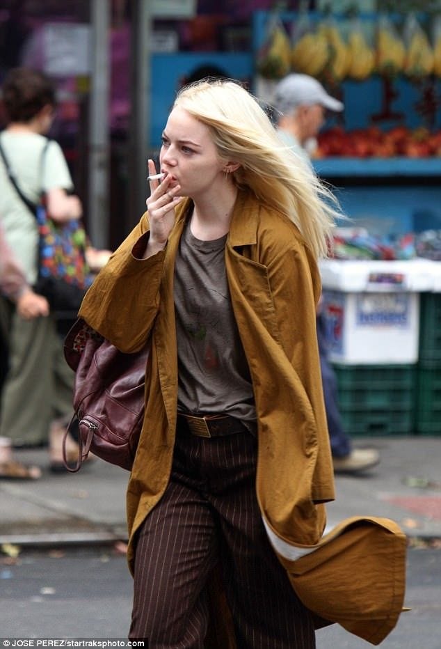
Here is another Spring we can compare.
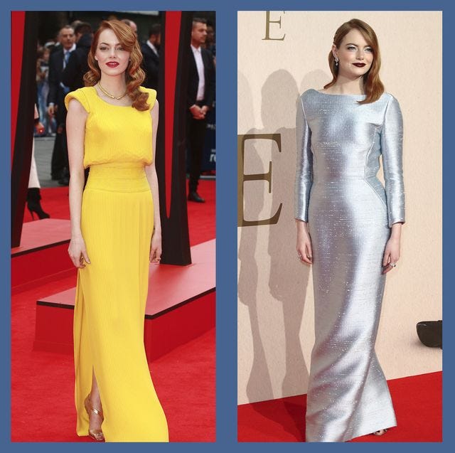
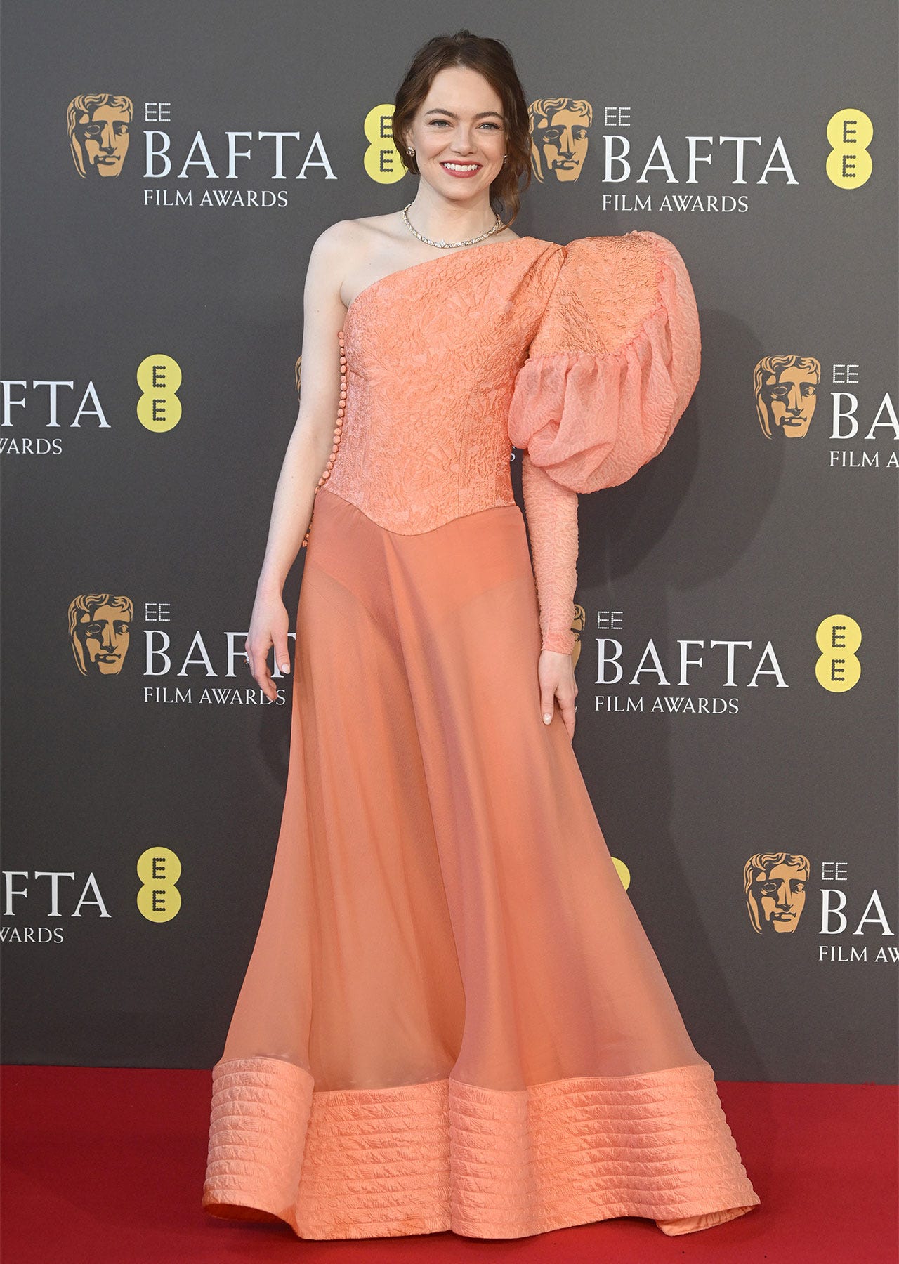
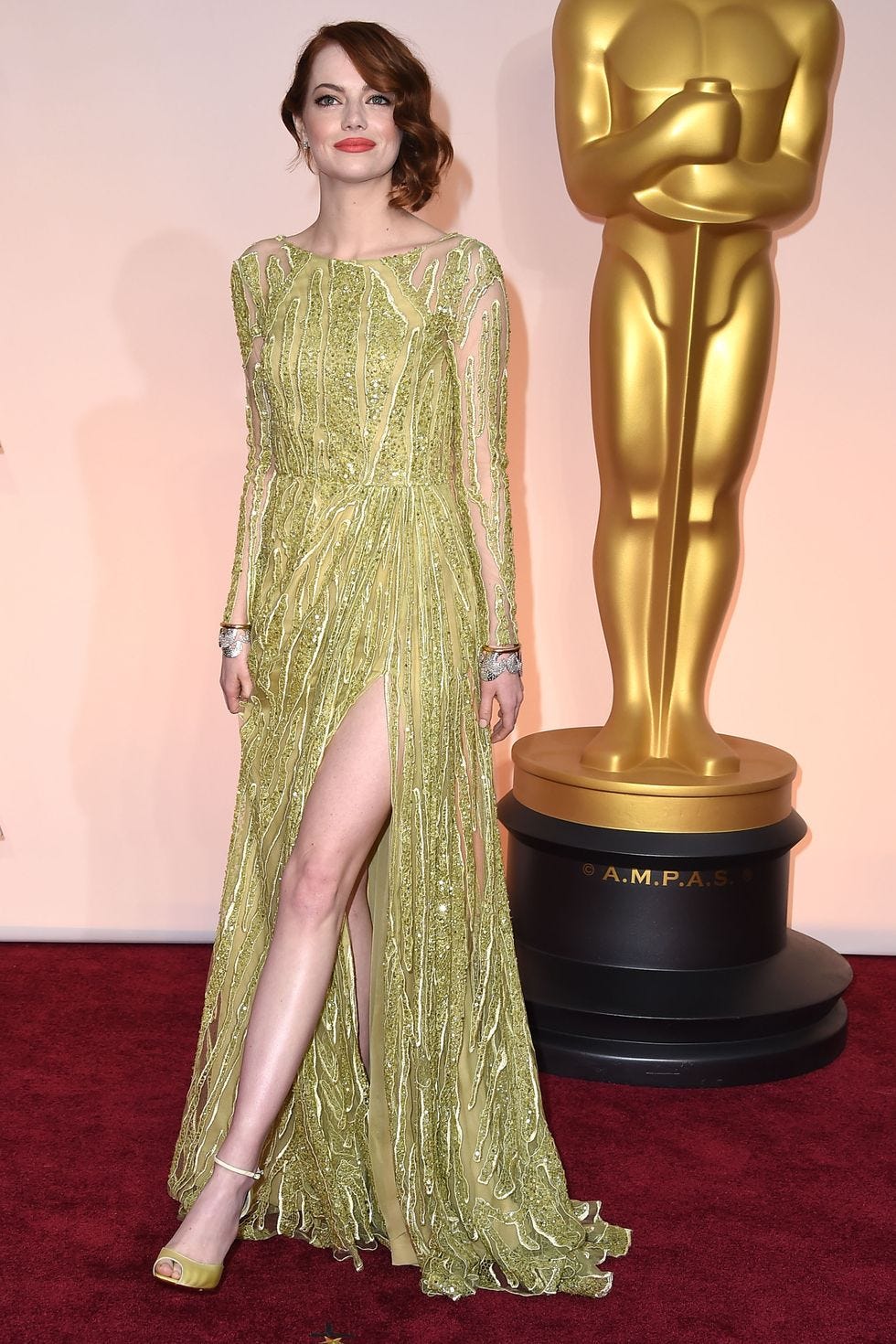
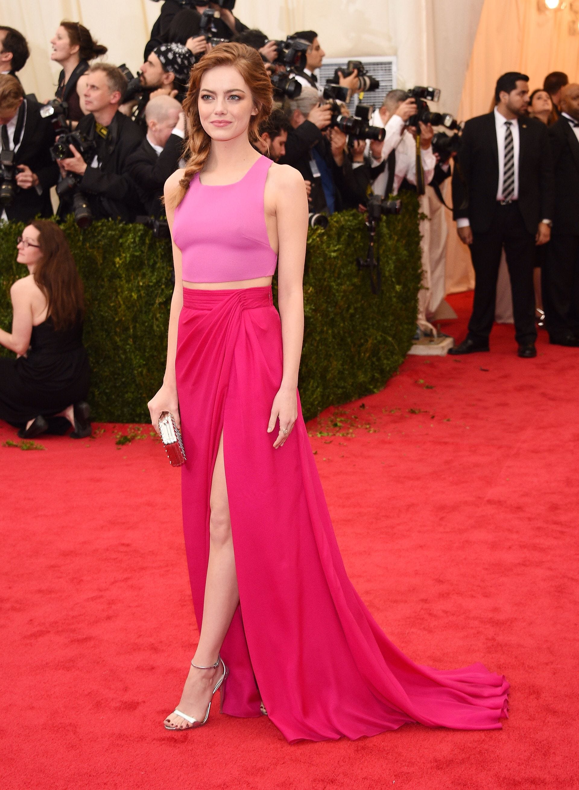
Emma Stone is a great example of why being fair-skinned doesn’t necessarily mean you have a cool undertone. On the left, Emma is in a warm, bright yellow with a warm, red lipstick. On the right, Emma is in a cool, silver dress with a dark, cool lipstick – the right look would probably look amazing on a Winter, and while it would take a lot to make Emma Stone look bad, something doesn’t quite feel right with these colors on her.
Here are some more looks of Emma in cool colors:


Versus Emma in warm colors that are more in her palette:
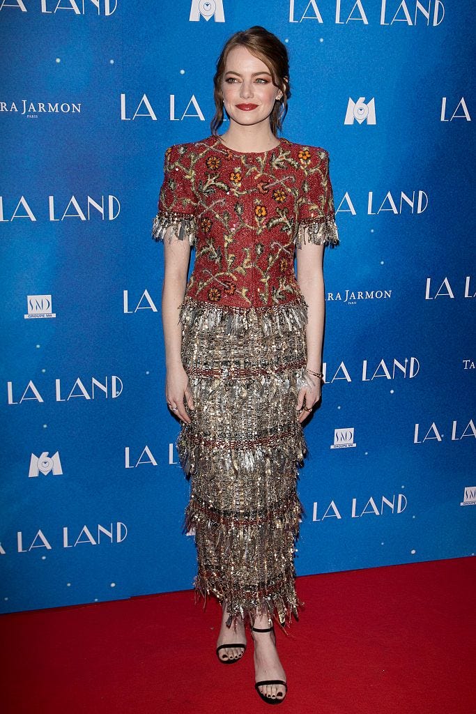
Some of these colors may be a bit more in the Autumn palette, but because they have a warm undertone, they still honor her warmth.
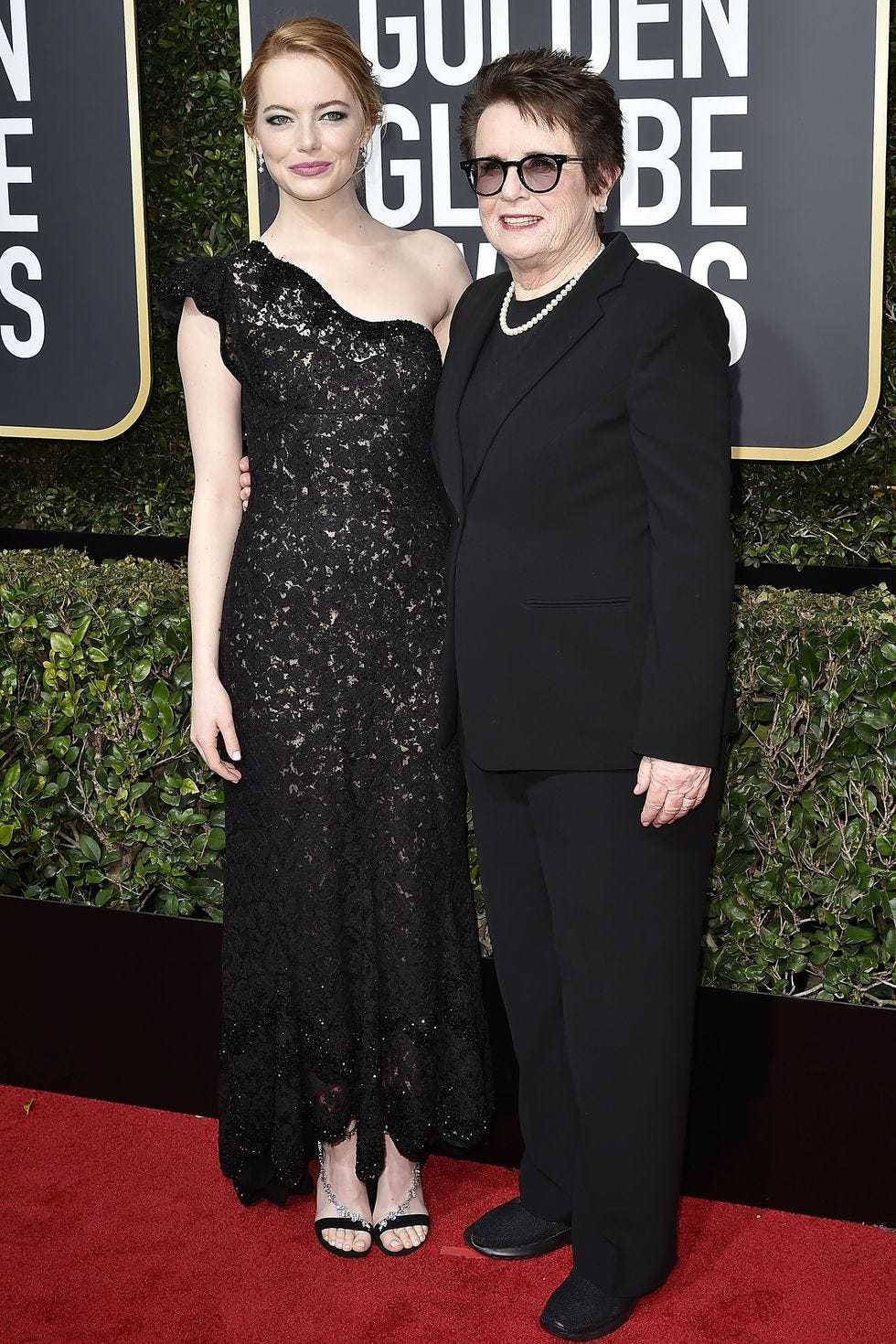
This image of Emma is really interesting to me because she’s actually wearing Bright Winter colors, which is right next to Bright Spring on the color spectrum. So, technically, the intensity still works great on her! But a bright color with a warm undertone would have probably worked a touch better.
why I like color analysis
Some people know themselves very well, and to those people I say, *tips hat*, respect. Wear what you want to wear, be who you want to be! I, however, have possibly taken every quiz known to man that will tell me even an ounce of who I am because I love knowing I belong to something, and I can also get very easily uncentered. I’ll watch a movie and suddenly decide I want to be that character, buying clothes just like them because it’s fun to play. I watched the movie Joy when it was in theaters, practically ran home after, and cut my hair short. Myself. With craft store scissors. Jennifer Lawrence can have that effect.
But… when I get out of that phase, I’m left with a bunch of things that aren’t me, as well as less money in my bank account. Now when I shop and see something I love and am about to add it to my cart, I pause and ask myself, “Is this in my palette and a color I like and feel good in? Or did I just see a model pull it off very well and want to be just like them?” I get a bit overwhelmed by having too many options, so I personally need an excuse that acts as a filter. It’s also really making me embrace colors I used to always shy away from, like corals, and golds. I’ve always been such a silver girly!
Since figuring out my sub-season, I’ve still been very into it, watching videos of fabrics getting draped over and over on people, sharpening my skills to pick up on the subtlest of differences between colors. It’s hard and takes a lot of training! So, while I’m not a licensed image consultant (I’m looking into courses), I do think my eye for it is getting better and better, and I want to help people who were once as lost as me understand what all this is really about, AND, find their type! (, if you would like for me to look at you and try to help steer you in the right direction, I must admit, I’m getting pretty good at it!)
final thoughts
I think a common misconception is that people think of color analysis as “this color looks good on you” and “this color looks bad on you”, and it causes them to be resistant to the concept. Nobody wants to be told their go-to or favorite color looks bad on them, but that’s not what color analysis is about. There really are no good or bad colors, per se – it’s about what is a better option according to your skin’s natural undertone, and finding colors that empower you and make you glow for the moments where you want to glow! Like color theory, it can also be used very intentionally for branding purposes… but more on that later.
Next week, I’ll provide some tips on where to start if you’re trying to find your color season, as well as bust some myths, because if you try to look up any of this stuff online the information is not very consistent, and it’s frustrating!
Until then, leaving you with yet another color analysis video that is just a delight!
– Er 🌹