
#11: color analysis 101 (part 2)
all my secrets to finding your color season ❄️🌷🍁🌊

Hello, hyperfixaters! Welcome back to the rabbit hole. In case you missed my last story, I discussed my obsession with Color Analysis and my long, personal journey with it – so long and personal that this week I’m here to provide the tips I’ve learned throughout that process to help you avoid any confusion and narrow down your color season with ease!
*Reminder that I am not a professional color analyst, just someone who has spent a lot of time learning about this online, and I’m also a Bright Spring!
Before we get into the Do’s and Don’ts, I think it’s important we quickly break down the three most important aspects of Color Analysis, in a way that’s (hopefully) easy to understand. Say it with me now:
Undertone. Intensity. Value.
1. Undertone = Warm Vs. Cool
Last week, I briefly mentioned Johann Wolfgang von Goethe, the German writer and philosopher who defined warm colors as yellow-based and cool colors as blue-based. Essentially, if a color has yellow mixed into it then that color is considered warm, and if a color has blue mixed into it that color is considered cool.


(Zooey was actually recently confirmed in person by a professional color analyst to be a True Winter!)
2. Intensity = Bright (or Clear) Vs. Soft
Pretty self-explanatory, but think of this as how saturated the color is. Is it a bold, popping color? This color would be considered medium-high intensity, and “bright.” Or is is a bit dusty and muted? These colors would be considered low intensity, or “soft.” Soft colors actually have some amount of gray mixed into them!

Let’s say you tried the Orange vs. Fuchsia test up above, but you still felt like neither color looked amazing on you and you’re still lost! It could be that the intensity was just a bit too high. Instead, try the test of Salmon vs. Baby Pink to start. The Salmon is light and warm; the Pink is light and cool. If there isn’t an obvious choice, it could be that lightness is your more predominant quality… but more on that later.


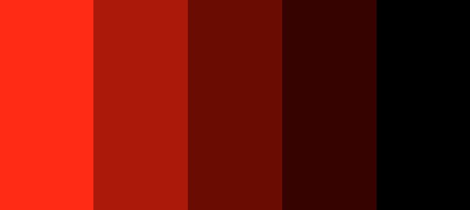
3. Value = Light Vs. Deep (or “Dark”)
A Light color technically means that more white has been mixed in (think pastels as the ultimate example.) A Deep/Dark mean more black has been mixed in. Above, you saw what happens when red gets “softer”; let’s see what it looks like when red gets “deeper/darker”:
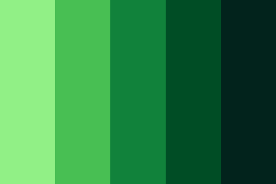
Or, how about a light green going to a deep, dark green? See how they’re almost black towards the end?
altogether, now!
Still with me? I know this is a lot! Here again is the Sub-Season wheel my color analysts used and sent to me when I got my result. I’m gonna try to make this all make sense now by grouping the seasons by their predominant qualities, give you the summary of each sub-season’s features, as well as their sister seasons (the colors you can borrow for your palette) and the reason why it’s their sister season (hint: the reason is the predominant quality!)
Remember, “Warm” or “Cool” refers to the undertone, “Bright/Clear” or “Soft” refers to the intensity, and “Light” or “Dark/Deep” refers to the value.
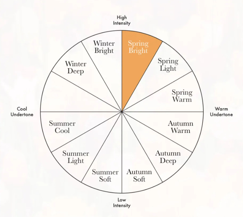
Brights
Winter Bright:
Cool Undertone ❄️
High Intensity
Predominant quality is brightness
Sister seasons are Bright Spring (to the right) and Winter Deep (to the left)
Spring Bright:
Warm Undertone ☀️
High Intensity
Predominant quality is brightness
Sister seasons are Bright Winter (to the left) and Light Spring (to the right)
Deeps
Winter Deep:
Cool Undertone ❄️
Medium-High Intensity
Predominantly quality is Depth
Sister season is Autumn Deep (directly across from each other on the chart)
Autumn Deep:
Warm Undertone 🍁
Medium-Low Intensity
Predominantly quality is Depth
Sister season is Winter Deep (directly across from each other on the chart)
Lights
Spring Light:
Warm Undertone ☀️
Medium-High Intensity
Predominant quality is Lightness
Sister season is Summer Light (directly across from each other on the chart)
Summer Light:
Cool Undertone 🌊
Medium-Low Intensity
Predominant quality is Lightness
Sister season is Spring Light (directly across from each other on the chart)
Cools
Winter Cool (missing from the graph for some reason):
Cool Undertone ❄️
Medium Intensity
Predominantly Cool
Sister seasons are Winter Deep (to the left) and Summer Cool (to the right)
Summer Cool:
Cool Undertone 🌊
Medium Intensity
Predominantly Cool
Sister seasons are Winter Cool (to the left) and Summer Light (to the right)
Warms
Spring Warm:
Warm Undertone ☀️
Medium Intensity
Predominantly Warm
Sister seasons are Spring Light (to the left) and Autumn Warm (to the right)
Autumn Warm:
Warm Undertone 🍁
Medium Intensity
Predominantly Warm
Sister seasons are Spring Warm (to the left) and Autumn Deep (to the right)
Softs
Summer Soft:
Cool Undertone 🌊
Low Intensity
Predominant Quality is Softness
Sister seasons are Summer Light (to the left) and Autumn Soft (to the right)
Autumn Soft:
Warm Undertone 🍁
Low Intensity
Predominant quality is Softness
Sister seasons are Summer Soft (to the left) and Autumn Deep (to the right)
“True Seasons”
If you see “True Autumn” or “True Summer” or True in front of a season, that means that person can pretty equally pull off all of the colors in that entire season. So if I were a True Spring, then my color palette would be made up of the Bright Spring, Light Spring, and Warm Spring colors.
the do’s and don’ts of finding your color season
I’m going to start with the don’ts before I get to the do’s, because there is a lot of information out there I don’t think is helpful.
don’ts:
Don’t just go off of celebrities you think look like you. When you’re totally starting out, it’s only natural to look at people and celebrities who have similar features to yours to determine your color season, and this can definitely help with narrowing down maybe your maybe undertone or intensity. However, while your hair, eyes, and of course skin tone do matter when looking at you as a whole, it doesn’t mean that all people with—in my case—dark brown hair, light blue eyes, fair skin and freckles are Springs! The whole picture really matters! Also, many celebrities have dyed hair, spray tans, makeup, etc. in most of their photos, so it can be very hard to tell. But I have a solution for you in the Do section!
Don’t go off the’ vein test’. I hate to break it to you, but the vein test… it don’t mean shit. To quote this article, “The theory states that if the veins on your wrists appear to be more purple/blue, you have a cool undertone, and if they appear green you are warm. We find that this is very confusing, as we have encountered lots of warm individuals with blue veins and vice versa. The vein test is not reliable because the colour of the veins depends on how deep they are inside the skin as well as which veins you are considering. Moreover, we want to emphasize our face, not our wrist! A professional colour analyst won’t ask you to show them your veins and they won’t be interested in analysing your vein colour to determine your undertone.”
Don’t assume tan/dark skin = warm undertone. A lot of people might describe themselves as having “olive” skin, and therefore think that must mean they’re either a Spring or an Autumn, but tan skin, olive skin, and people of color can have cool undertones too! And that’s what we’re looking at, what is harmonious with your undertone… not your overtone, which can change with age, sun exposure, cosmetics, yada yada.
Don’t assume light/fair skin = cool undertone. I’m pretty pale, and always have been, so I never would have thought I was a warm season! But once again, being light-skinned is my overtone.
Don’t wear makeup if you’re doing a DIY color analysis. Ever tell a person with blue eyes they can pull off any blue? As humans, we tend to look for patterns, so even though the blues that are better for my palette should be bright, light, and warm, I could probably get away a bit more than a Spring without blue eyes wearing a Summer blue color, for example. That said, when you wear lipstick or blush in a certain color, it’s going to form a bias because you may be subconsciously looking to match that color. Remember to look at your face and how your lips naturally react when draping colors!
do’s
Do look at celebrity photos from when they were a bit younger. Not in a creepy wayyyy. Just because as celebrities get older, they get spray tans, dye their hair, wear makeup, etc. If you can, look up younger photos of celebs you think you share features from when they were a bit younger so you can see all of their natural qualities, and look at a bunch of photos of them in different colors and try to nice which they shine more in.
Try to find out what your predominant quality is. Is your hair much more intense than your skin tone? Are your eyes very light while your skin and hair are both dark? Or does the intensity all kind of mix together without any features in particular jumping out? How light do you appear? One way to help figure this out is by looking at the contrast of your features. Take a photo of yourself and look at it in black and white – how high is your contrast level? Here’s a photo of me from an old, unedited headshot in black and white:


Try putting the color behind you, as if you were doing a photo shoot! (I bet you probably even instinctively know if a bright teal or an olive green is going to look good behind you...) If you do this is, make sure you know the three characteristics of each color so you can accurately compare!
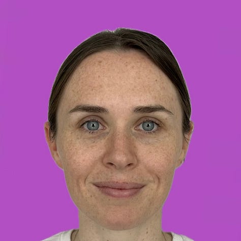


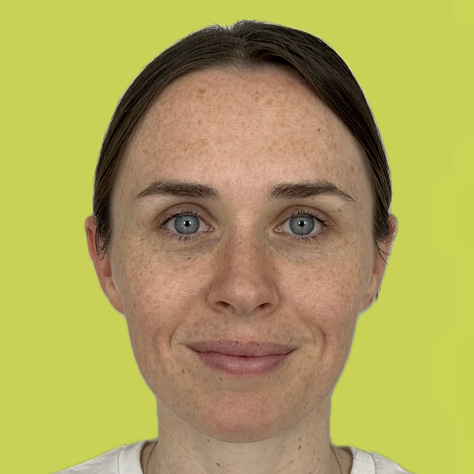
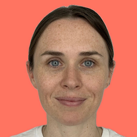

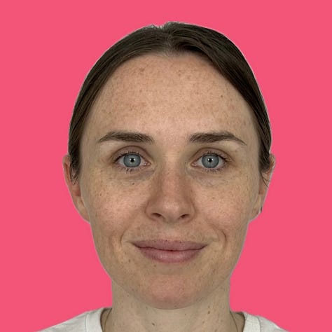

This is the actual photo I used and sent for my color analysis! I googled my colors and put my outline over them. Here’s me in some of my Bright Spring colors! Do make sure you use the right lighting (a bit far back from a window with light but not in direct sunlight and have even lighting on your face), stand against a neutral background, wear a white shirt with a and your haired tied back if you’re draping yourself or putting colors behind you digitally.


Lastly, try some of these tests to at least try to figure out your undertone, which will narrow your options down to two seasons! Focus on what is making your skin glow, and not making you look tired.
(Warm color is on the left, Cool color is on the right — varying intensities!)


If you happen to do the dark brown vs. navy blue test and think both colors look pretty harmonious on you then your predominant quality may be depth!
Similarly, if you did the salmon vs. baby pink test and it’s also a very close call, then your predominant quality may be lightness!

OKAY
Omg wow I’m such a nerd. I may need to do a part 3, because there is so much more I want to talk about, like comparing celebrities and pointing out their seasons and outfits they wear but I’m past the email limit!! Was this helpful at all? Any questions? Do we hate this and very much do not need any more color analysis content? Let me know in a comment! Love you all! Sorry for all the pictures of my face!
— Er 🌹